コラム

1-1-5②図

構築したネットワークの全体図

A complex network graph showing relationships between various economic and business nodes. Nodes are represented by colored circles (purple, green, orange) and connected by lines (edges). Text labels in Japanese are placed around the nodes, representing specific economic indicators or business conditions. The graph is titled '2017年4月~2024年11月' at the bottom right. The nodes are clustered into several groups, with a large purple cluster on the left and a green cluster on the right. The central area shows a dense web of connections.

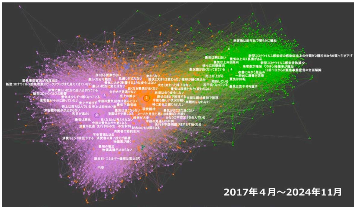
資料:内閣府「景気ウォッチャー調査」より中小企業庁作成

(注) 1. 図中の点は「ノード」、矢印は「エッジ」を表す。また、図中の文字は、代表的なノードの文言を抜粋して示したものである。

2. 図中の1~5の数字は、1を「悪い」、5を「良い」とする5段階の景気判断の回答。

3. 2017年4月から2024年11月までの内閣府「景気ウォッチャー調査」から取得したデータを対象に、次数15以上のノードに絞って可視化したネットワークを表示している。

次に時期ごとのネットワークの変化を分析する。2017年4月から、各年度を上半期と下半期に分けて分析を行う。なお、本分析のデータ収集時点に公開されていたデータの最新時点は2024年11月であったため、2024年度下半期は2か月分のデータしか含まれていないことに留意が必要である。

コラム1-1-5③図は、2017年度上半期・2020年度上半期・2021年度上半期・2024年度上半期の各時期のネットワークを可視化したものである。これを見ると、2017年度上半期においては、左上の「新型コロナウイルスの影響」を起点としたネガティブな影響に対応する部分のエッジが見られない。一方、2020年度上半期と2021年度上半期については、2020年度上半期では「新型コロナウイルスの影響」を起点とした負の影響に関するエッジが増加し、2021年度上半期では右上に位置するワクチン接種などの正の影響に対応するエッジも増加している。2024年度上半期では「新型コロナウイルスの影響」に関するエッジは減少し、下部に見られる物価高や円安の負の影響が顕著となっている。このように構築したネットワークは、時期ごとの特徴の違いを明確に捉えている。